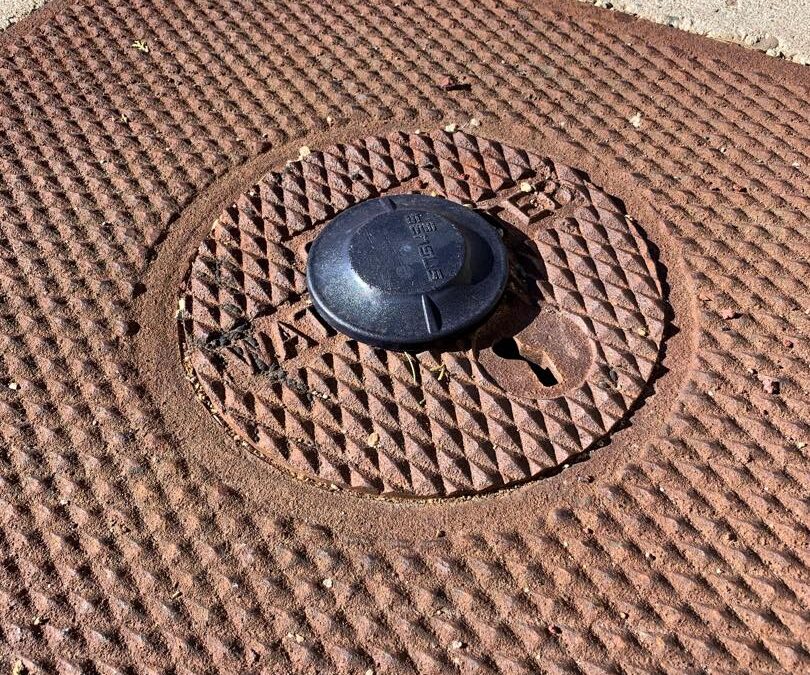
If you have a meter equipped with AMI (Advanced Metering Infrastructure) as shown in the photo above, you can log into your Water Authority account and see your hour-by-hour usage. This may help you locate any issues in your house or yard, such as a continuous water leak in toilets or irrigation systems. It can help you understand how much water you use throughout your day and serve as a guide to better decision-making in how you use your water. If you don’t have an AMI meter installed yet, it will produce an average use graph for your home.
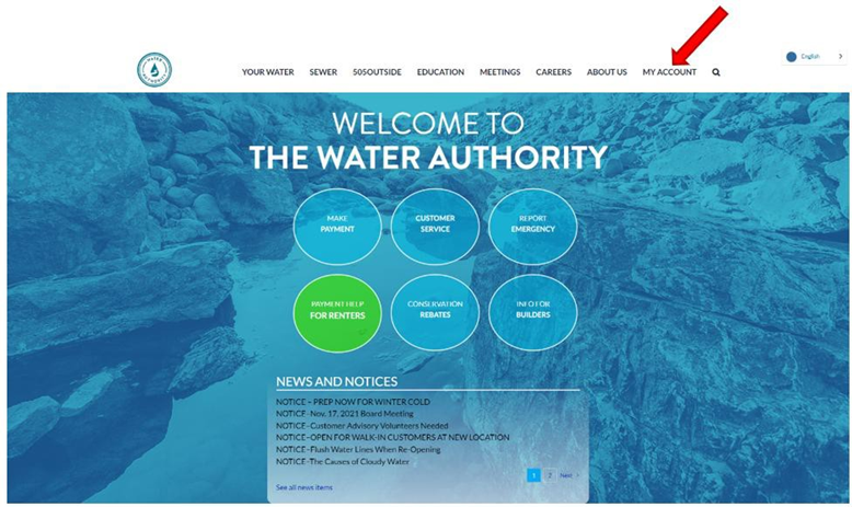
Start by going to www.abcwua.org. Click on “My Account” in the top menu bar (shown below with a red arrow) to create an account if you haven’t done so already. You’ll need your billing information. Once you’ve created an account, you can view and pay your bills, as well as see your daily water usage.
Here is an example of the account page. We are going to focus on the “View Water Usage” section. It can take a few moments to add the dashboard information.
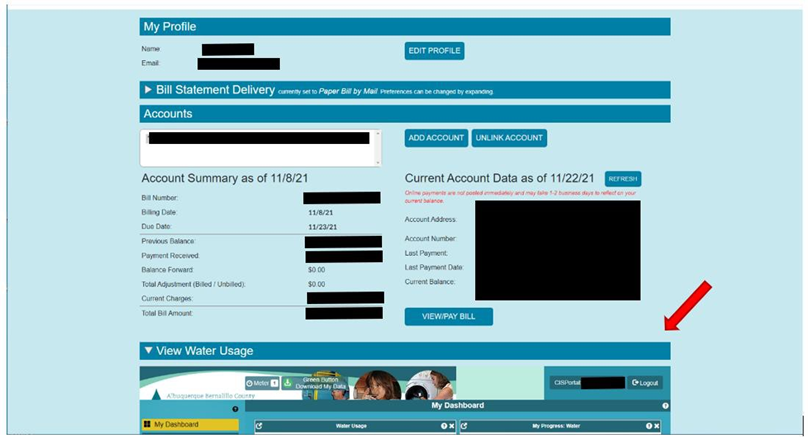
Initially, you will have two screens in your dashboard: “Water Usage” and “My Progress.” You can expand each one by clicking on the icon in the top left corner (red arrows). This will make the information easier to read and provide access to some additional features.
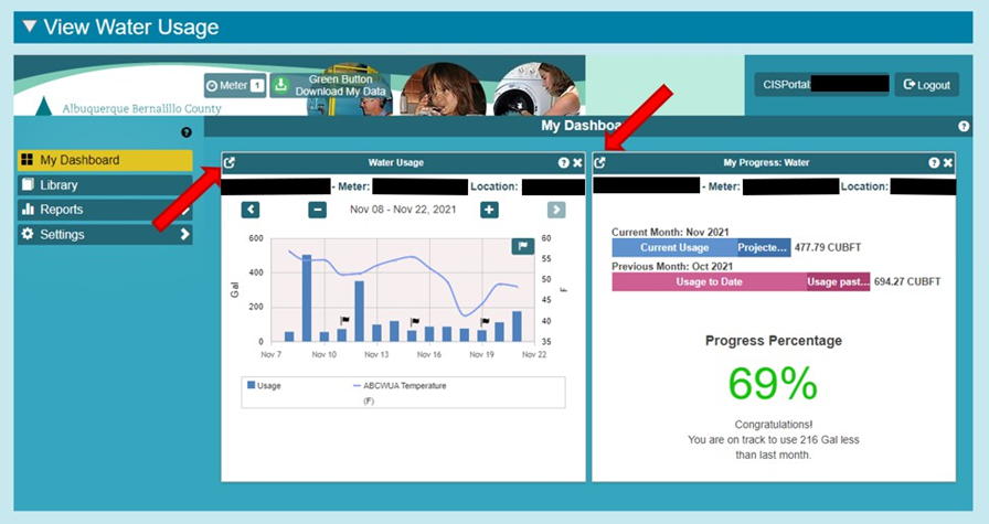
Below is a graph that provides you with a glance of your daily usage, along with the average temperature for that day. Two features highlighted in this photo are: 1) the “+” sign will change the date parameter and provide hourly usage and 2) the “PNG” feature will export your usage chart if you want to save it as a picture.
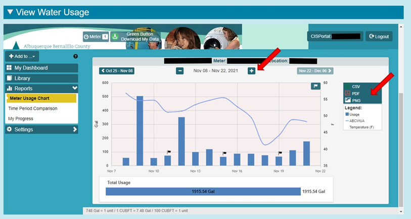
On the right-hand side, where the red arrow is, the “PDF” feature allows you to download the current month’s hourly data. An example of this is shown in the following image.
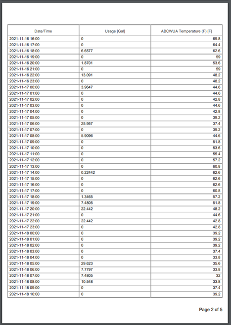
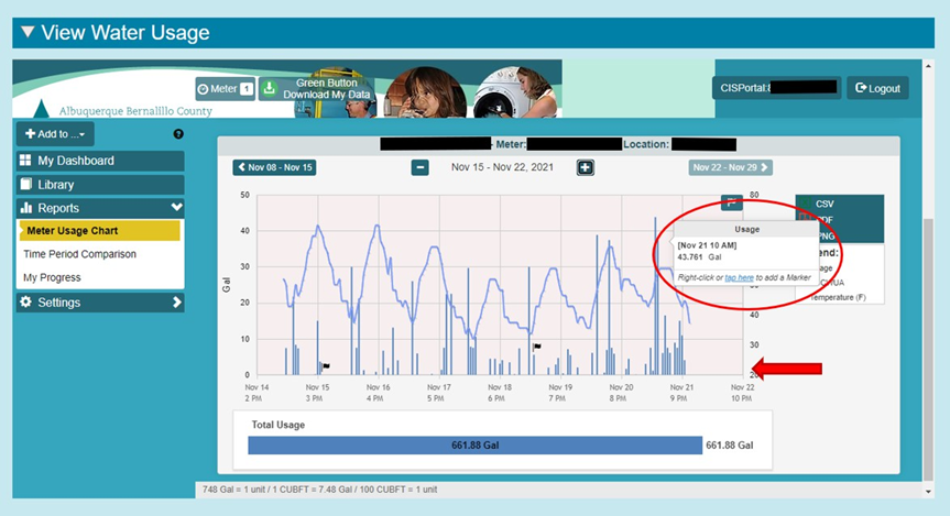
Below is an example of an hourly chart of your water usage, with the hourly temperature shown as well. Note: You can view your actual usage on each line of the graph by hovering your pointer over it. This is where you may see a possible leak if you have vertical lines (hourly usage) each hour, daily. A red arrow highlights where you would see that.
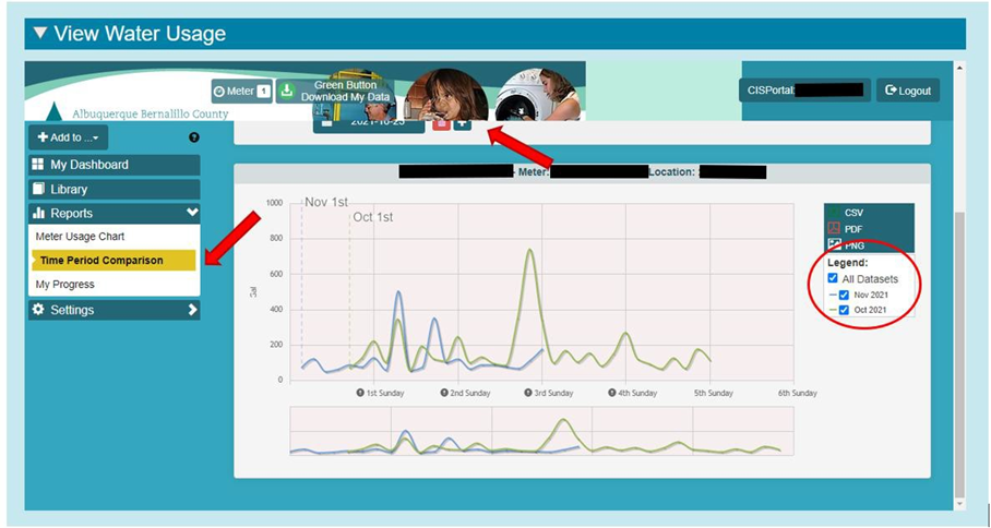
Next, we’ll look at a monthly comparison. To do this, choose “Time Period Comparison” on the left (highlighted by the red arrow). This example shows consecutive months, but you can adjust the view using the “slider” [TS2] above the graph to click on the months. You can compare your usage for the same month from one year to the next. This is great if you are trying to track savings from changes in your household or irrigation.
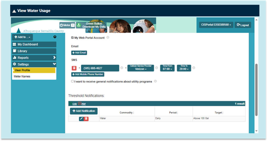
You can add a threshold notification that will inform you when your water use passes a set amount. The threshold should start at your “normal” daily usage. So, if your normal usage in the winter is 100 gallons a day, you can add that as your threshold, and our system will notify you if you’ve gone above the threshold. This picture shows you how to add a threshold. You can add an email address or phone number to receive the notifications.
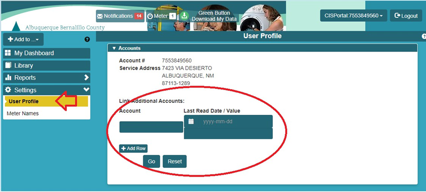
If you have more than one account that you watch over, you can go to the user profile tab and add additional account numbers to your profile.
Watch our How To Video below!
